
Paris 2024 - A Bold New Identity
-
For my final project in the NFTS Motion Graphics course, we were given a selection of briefs to showcase our skills.
I chose to create a new brand identity for the Paris Summer Olympics. I aimed to develop 3-4 visual aspects to show how the design would be implemented. These can be seen below, with some details about how I created them.
ENJOY!
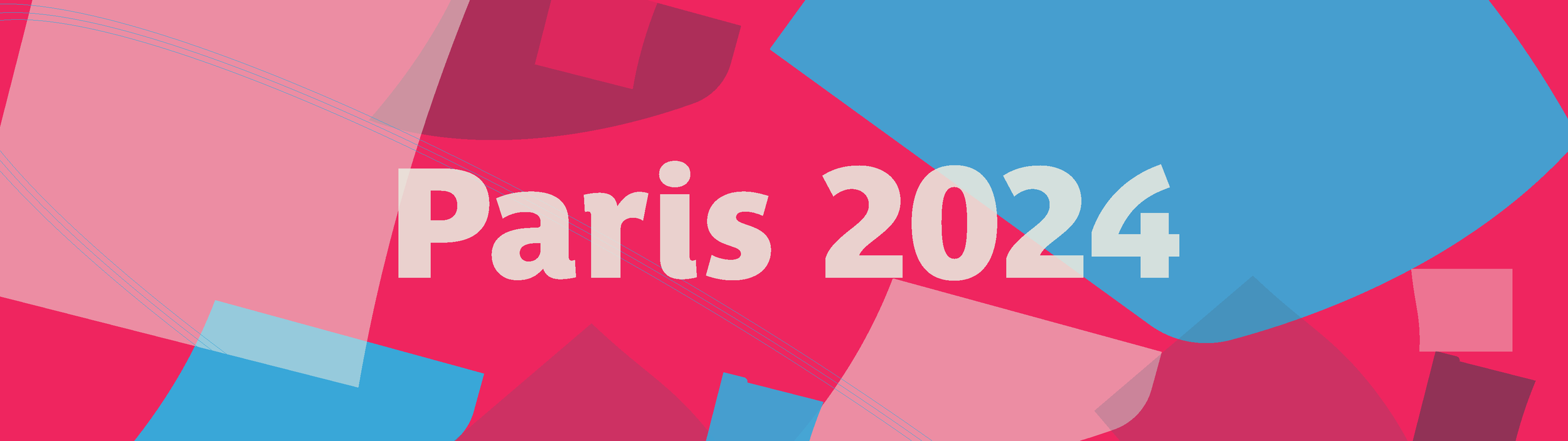
The Logo
Paris 2024 Rebrand - Sizzle Reel

-
The 1924 Summer Olympics logo (shown below), coincidentally also hosted in Paris, inspires the shield design. The decision to separate the shield was influenced by abstract French art and the idea of breaking down a symbol, common with defending a person during a war and displaying an army’s identity, to demonstrate the openness Paris would show as they invited the world to its city. The lines formed from splitting the shield make it appear similar to a window, which further shows the idea of openness.
The colours are derived from the Paris (also shown below) and French flag but with a punchier twist. The patterns featured also appear on the Paris flag and the 1924 logo which serves as a homage.

Title Sequence
-
The concept for the title sequence was to show the pieces of the logo ‘participating’ in the sports. I spent time studying the movements of the sports shown in the sequence and adapted them to fit naturally with the shapes. I designed and animated the sequence, and the music composed by a fellow NFTS student, Kathrine Wandall.
Broadcast Stings
-
The stings are derived from the title sequence and can be used between TV segments and for online content. The patterns are very satisfying and grab attention, which are key aspects of my visual identity.
Broadcast Graphics
Football
Swimming
Gymnastics
-
The idea here was to use one part of the shield as the base for any graphic. This would allow for each sport to have its own ‘personality’ but still be part of the wider visual identity, as demonstrated above. Key information is shown in rectangles to stay within Olympic guidelines without sacrificing the abstract feel.
Branding - Stadium


-
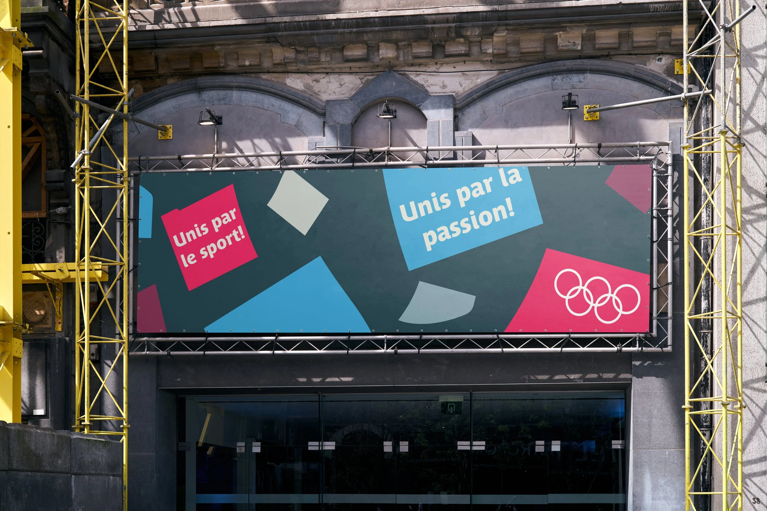
I donned the branding theme, Beautiful Chaos. Paris is a city full of life and vast numbers of characters. A melting pot of nationalities and classes. I wanted to embody that in the branding by scattering different coloured shapes of the shield across the canvas to encapsulate that. Once the beautiful chaos was created, I began applying it to the different mediums required for an Olympics. Firstly, I designed a 3D model of the French national stadium, Stade De France, the home of athletics and football for the games. I used Cinema 4D to assemble the structure and a mixture of Illustrator and Photoshop to draft the shape of the bowl and designing the track and field for the stadium along with the stadium graphics.
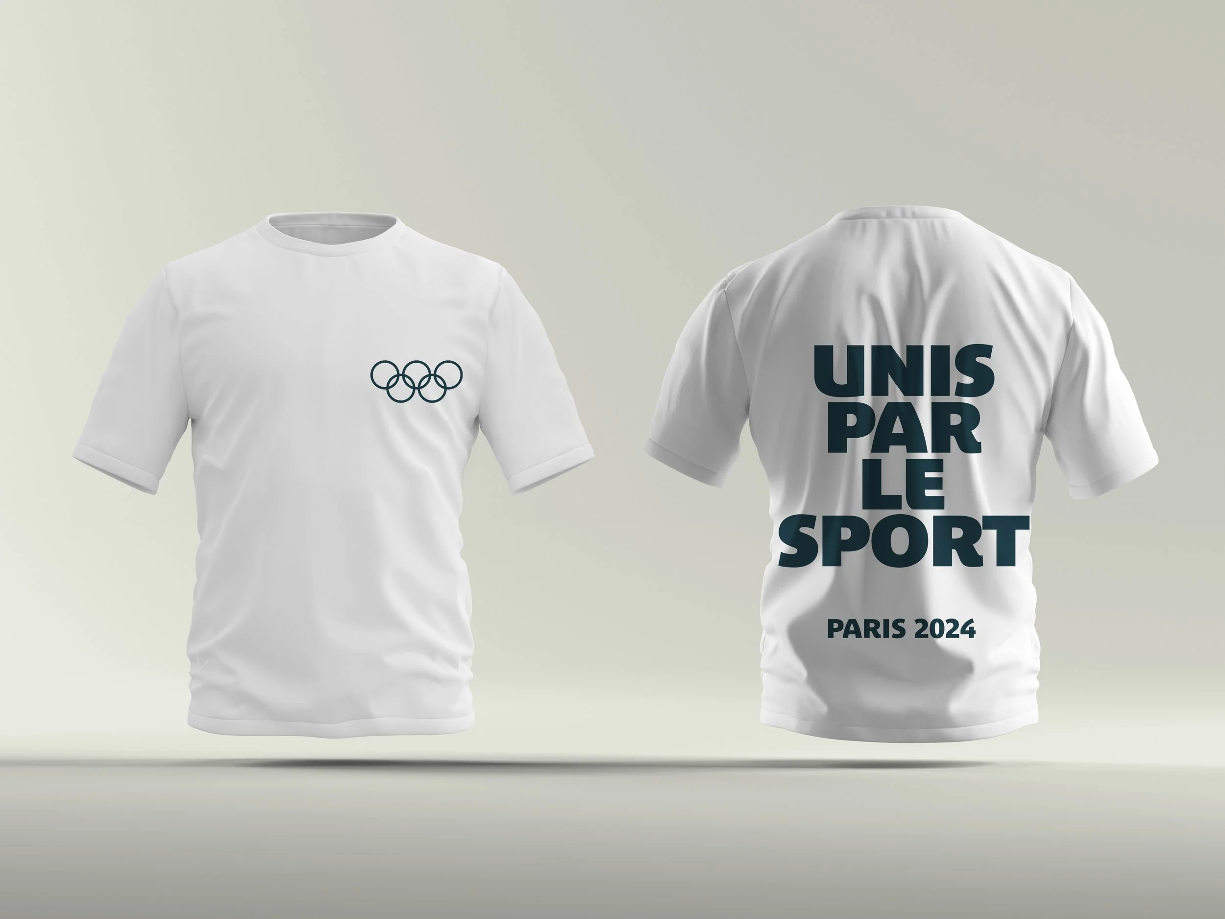
Branding - Print & Merchandise


-
I then applied the same logic to the advertising material & merchandise. Using the slogan, Unis par le sport, unis par la passion (united by sport, united by passion) as a CTA.